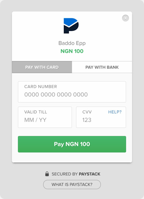
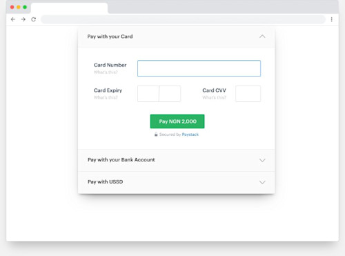
In June 2018, over 282,000 people paid Nigerian businesses using Paystack Checkout. Paystack is a Nigerian company that helps African merchants get paid by anyone, anywhere in the world. Though our 27,000 merchants may use our full suite of products, the Checkout form is the first, and maybe only, touchpoint for a majority of users.
I’m one of the three founding team members at Paystack. I was solely responsible for all the design and frontend work in the early days, and now I lead the product design team. Because of this early design involvement, a lot of detail goes into building our products. Our design ethos is to get our customers to “trust easy.” The goal for every product is to deliver a fast and beautiful experience that always works.
The first version of Checkout lived up to this promise. We’d built out a lightweight application without any frameworks, and in the beginning it was snappy and easy. But with our transaction numbers growing 20 percent every month, performance started to wane. By June 2018, 71 percent of Checkout’s monthly users placed their payment from a mobile phone. With 94 percent from Nigeria, where internet speeds can get really slow, the average load time had gradually climbed to 8.3 seconds.
Another clue that we had to upgrade Checkout was that we couldn’t add any more payment methods to it. We’d started work on the engine for two new payment methods knowing that we had nowhere to put them on the Checkout form! In a really short time, several more considerations came up. Eventually, we ended up with eight compelling reasons to build a new version of Checkout from scratch:
to make it better at handling scale;
to make it better at handling multiple currencies, internationalization, and new mid- and post-payment flows (as well as more than two payment methods);
to improve trust with the interface;
to improve trust with online payments in Nigeria specifically;
to create an error-resolution flow that drives better success rates;
to hold the customerʼs hand throughout the entire payment to ensure the transaction happens;
to make the checkout experience delightful (so much so that anyone would prefer it for paying online, and
to make it easier to maintain.
Our beta launch in Ghana was scheduled for a few months away, and since we needed the new payment methods ready for the launch, we quickly set to work.
Start with questions
We wanted to understand what worked about the current form. We didn’t have the time for extensive customer research, so we answered questions with our Google Analytics data and informal surveys with our customer success team. Because they spend a lot of time communicating with customers, they’re a great source of sentiment.
Questions for Google Analytics
What is our audience like?
What devices do they use?
How long does a typical payment session last? Is it longer on certain devices?
How quickly do people see the other payment option? Do they even see it?
How fast does Checkout perform?
Questions for our customer success team
What features do people currently love?
What issues do people frequently complain about?
Questions from our data
How well is the current version performing?
How much do we lose from abandoned payments?
What percentage of transactions could have been saved by suggesting an alternate payment method?
These questions not only ensured that everything that made the previous Checkout successful were represented in the new iteration, but also were a good way to benchmark performance. After we had our answers, we continued to the codebase.
Build a library
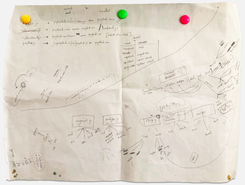
The codebase for the first version had gathered a lot of technical debt. It was largely written by one generalist team member, and after two years had become very difficult for the team to understand, maintain, or extend. It was also hosted on the same repository as our marketing site because it was the fastest way to have the URLs served from the paystack.com domain. Over time, the marketing site had itself grown from a simple, static site into a complex Craft CMS codebase. What we’d ended up with was a Frankenstein repo that was difficult to debug and complex to improve.
Our first goal was to separate the codebases and move the Checkout form to its own repo with a clean build process. This was a chance to quickly rebuild the app from the ground up using a modern framework. Our three-person team of designer-developers was mostly familiar with Angular, so when it came to choosing a framework, we decided to go with Vue.js because it had the easiest learning curve and was lightweight enough not to add crazy bulk.
We next spent time extracting all the payment functions of the old Checkout form into a JavaScript library we called Checkout JS. This would achieve three things:
abstract the payment layer so it could be maintained independently;
allow us to offer stripped-down payment options; and
allow developers to design custom checkout experiences.
By the second month of development, we’d completed a beta version of Checkout JS and we started work on designing the Checkout form.
Design a user interface
Don't fix what isn't broken
The first design idea for the new Checkout form was to mimic the look of a browser dialog. We’d guessed that it would make people trust the interface more, but the changes weren’t well received. The customer success team helped us drop the idea, emphasizing that people trust familiarity. Paystack had already become well known for our checkout experience, and changing the design too drastically could confuse customers and lose us brand value. In the end, we stuck to making iterations that didn’t stray too far from our original form.
We also noted why people trusted the previous checkout experience:
the ease of use;
the choice of payment options;
the “Secured by Paystack” badge; and
the “What is Paystack” link (consequently our second-most visited page on the web).
All these would have to make it into the new form.
Try something new, then try it again
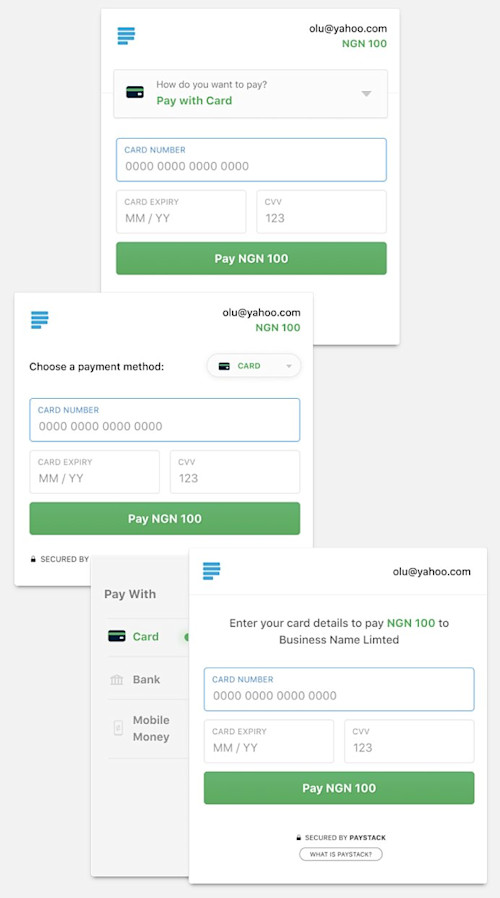
Iteration is the secret sauce of design. After breezing through our first dozen iterations, we iterated through a dozen more. Aside from the trust angle, we had another major design problem to solve: how to show four or more payment methods legibly and elegantly.
We ended up with four major iterations and created them in HTML and CSS. To test them, we asked team members to complete predefined tasks and tracked certain metrics. How long did it take to complete the tasks? How many of the other payment methods could they recall? How easy was it for them to find certain things?
Because we administered our tests remotely, many team members completed them leisurely, so the data wasn’t as usable as we expected. But in the end, everyone in the test group agreed on the same solution.
Prioritize mobile
Our Google Analytics data told us that 71 percent of our customers used Paystack Checkout from a mobile device, so it was a bit ironic that we approached the design desktop-first. Regardless, we were always going to design a unique mobile experience indifferent to what had been done for desktop devices.
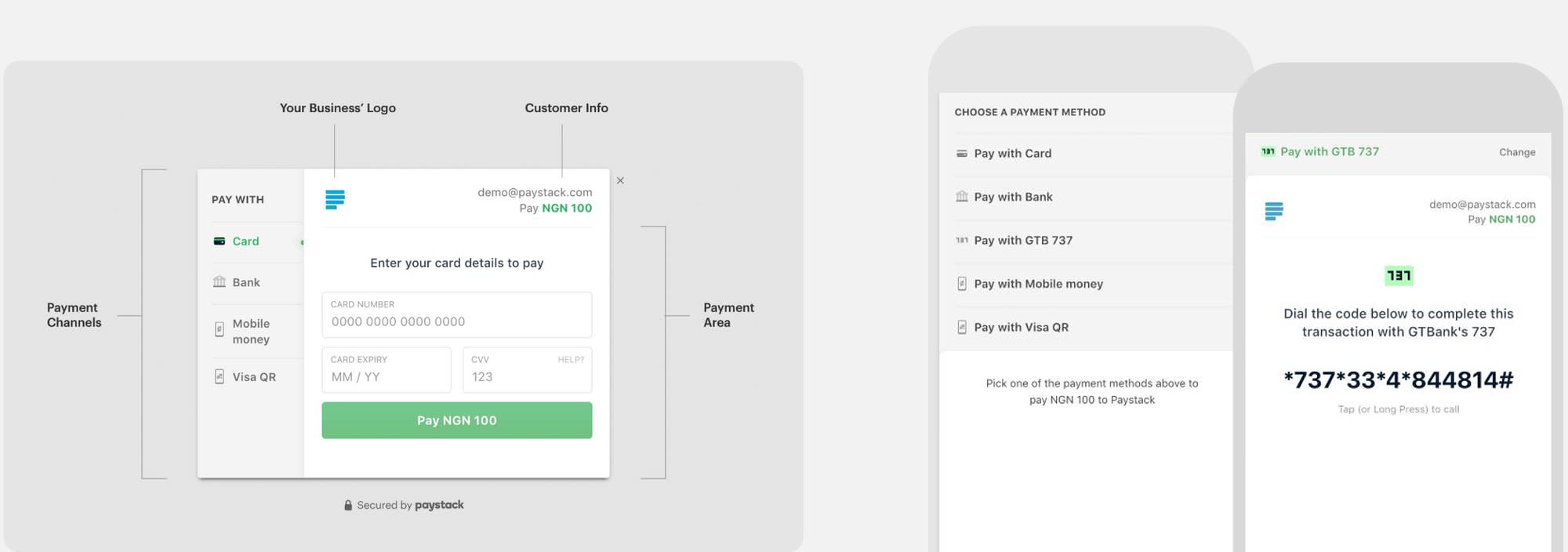
We ended up with a solution that required both design and code. The number of payment options available for any particular transaction determines what customers see first on mobile. If it’s just one, they see that payment option immediately. Otherwise, they first see a prompt to choose which of the available payment options they’d like to use. The downside of this approach is that it adds an extra interaction. But the upside is that customers can see all their options, and so far the response to this has been positive.
Make errors easy to fix
The goal of the Checkout form is to help a customer pay a merchant, and there are numerous reasons why an error might prevent that. In every case, there’s a chance we can salvage that transaction. Instead of throwing error messages around, we designed an error resolution module that both acknowledges the error—kindly—and suggests what the customer should do next to resolve it.
To do this, we pulled a list of error categories from our database. Then, for each of the categories, we identified possible solutions. For example, certain card errors will require that the customer physically visit their branch to resolve them. In those cases, we know not to suggest that the customer reuse that same card. If we have a connection to their bank, we suggest that they pay with their bank account. Otherwise, we suggest that the customer try another card.
Currently, this recommendation only works for known errors, but we’re looking to make Checkout more intelligent so it can recommend the best option even for unrecognized issues.
Inspire delight
Input assistance
The card entry component identifies when a card detail (such as a card number) is completed and automatically jumps to the next input. A surprising number of people mentioned this specific interaction as something they really enjoyed in the previous checkout experience.
Holiday greetings
On public holidays, Checkout automatically displays a warm and festive greeting to customers. We started with local holidays, but our long-term plan is to make the holidays relevant to a customer’s location. Customers paying from Ghana, for example, would see “Happy Independence Day” on March 6, while Nigerian customers would see that message on October 1.
Easy to test
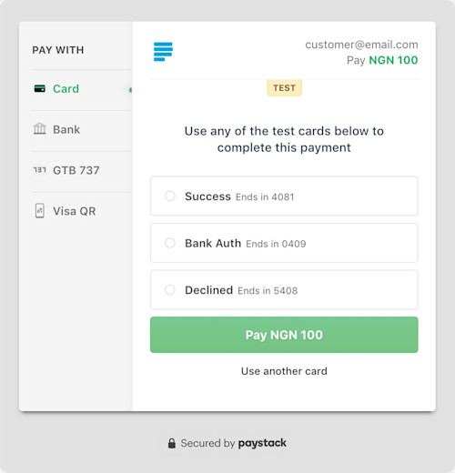
Developers need to make hundreds of payments when they’re testing their integration. To make that easier we moved our test cards into Checkout. In test mode, we present a list of cards that developers can just select and pay with. For non-card payment methods, we pre-fill test information.
Smart defaults
The order in which payment options appear is customized to device. And, if a customer uses a payment option frequently enough, it will bubble to the top of the list and eventually become the default.
Autofill forms
The error-resolution component allows a customer to reuse their payment details (such as card number and expiry date) in one click when they run into an error. This was created to remove the frustration of filling in the same information multiple times because of casual errors. However, we don’t pre-fill sensitive information like CVVs.
How did we do?
In November 2018, the second month after Paystack launched the new app, about 2.8 million users paid a Nigerian business using Paystack Checkout. Sixty-four percent of these users made their payment from a mobile phone and this time only 80 percent were from Nigeria. It took an average of 5.26 seconds to show any of the six payment methods we now provide.
| Country | Device | Load time (seconds) | Sessions (millions) | ||
|---|---|---|---|---|---|
| Jun | Nov | Jun | Nov | ||
| Nigeria | Mobile | 8.63 | 7.26 | 0.36 | 5.04 |
| Nigeria | Desktop | 7.92 | 2.61 | 0.12 | 1.92 |
| United States | Desktop | 2.92 | 1.48 | 0.002 | 0.29 |
| Nigeria | Tablet | 12.32 | 5.75 | 0.019 | 0.2 |
| United States | Mobile | 7.78 | 7.26 | 0.002 | 0.16 |
| United Kingdom | Desktop | 2.42 | 4.54 | 0.002 | 0.12 |
| Canada | Desktop | 0 | 1.34 | 0.0004 | 0.06 |
| India | Desktop | 2.27 | 1.03 | 0.0006 | 0.04 |
| Avg. 5.5325 | Avg. 3.9088 | Sum 0.506 | Sum 7.83 | ||
Comparing load times in the four countries we get the most traffic from. Sessions grew 15× between June and November.
Whether you’re designing a checkout experience for African customers or for customers elsewhere in the world, the processes required to improve performance and experience are the same. (Commerce is global, after all.) A customer from Nigeria may be new to card payments in the same way that another from Canada may be new to mobile money. In either case, the goal is to deliver a fast, secure, and helpful payment experience that genuinely inspires delight. We tell our merchants that, with Paystack, they can sell to anyone, anywhere in the world, with ease. We’ll keep improving Checkout to deliver on that promise.

