Computing is full of bad names for things, but if I had to pick a least favorite, it might be plain text. It’s the name given to data that is “just” text, as opposed to something more structured, like JSON, XML, or a binary encoding. The word plain paints a picture of simplicity: no frills, no need for extra libraries to use or manipulate this data—it should Just Work. And for the most part, this is true. Manipulating plain text is not a stumbling block for most developers.
But what do we really mean when we say text? Do we mean Text with a capital T, encompassing all human writing? Ideally, yes—but if so, text is anything but plain. Written language is one of the most intricate and complex technologies we’ve developed as a species. From the ideograms of East Asia to the cursive abjads of the Middle East to the syllabics of North America, the hundreds of living scripts in use today evolved organically and independently over millennia, and they are massively varied. What’s more, writing systems change over time, and entirely new ones can be developed when a language requires it. Text, by this inclusive definition, can never really be thought of as plain.
Worse is better
Unfortunately, this is not what the word text has meant for most of the history of mainstream computing. While I argue that text should be taken to mean human writing, in practice it tends to be defined as data encoded using the American Standard Code for Information Interchange, or ASCII. As one of the earliest digital text encodings, and—importantly—the encoding that became the foundation of Unix and early internet protocols, ASCII data over time became synonymous with the idea of digital text.
And ASCII is simple. Each character is represented as a single byte, which is compact and straightforward. Existing tools to manipulate and analyze computer memory worked seamlessly with this representation, and the new text-specific tools that were required were simple to build and reason about.
Like anything else in engineering, this simplicity is not without tradeoffs. ASCII’s seven-bit encoding allows for only 127 different characters, which is enough for the Latin alphabet in both upper and lower case, plus punctuation. This works for English, but it isn’t even enough for some European languages, let alone a representation all of human writing. It also assumes that every character has exactly one visual representation, which works for Latin-based languages, but not for others. In many ways, ASCII completely embodies Richard P. Gabriel’s notion of the “worse is better” software design philosophy, where simplicity of implementation takes priority over correctness. His essay is a criticism of Unix and C, but ASCII, emerging from that same era, reflects similar thinking. Although the implementation may be simple, ASCII’s representation of text is not, to anyone reading or writing in a non-Latin language, correct.
Work started in the late ‘80s on what would become Unicode, the text encoding standard in use today, with the explicit goal of meaningfully supporting every written human language, and by now there are enough libraries available to correctly handle multilingual text. Thanks to the colossal effort of thousands of engineers over three decades, things are better now than they’ve ever been. But software is a slow ship to steer, and we still live in the Latin-centric shadow of an ASCII-dominated world. The result is that many systems that Just Work with Latin text will require additional effort and mindfulness on the part of everyone involved to work with Text in general. These things have been made possible by recent advancements, but they have not yet been made seamless—or even easy.
Not Arabic
The most visible manifestation of this legacy is in digital typography. A lot of software that deals with type was designed for the Latin alphabet, and as a result tends to produce hopelessly wrong results when confronted with anything else. This is true for all non-Latin scripts, but the Arabic script in particular seems to present something of a pathological case for these systems. Correct Arabic text flows from right to left and is always cursive, but when fed into a program designed for Latin, the result is the opposite: unjoined letters that flow left to right, presenting nothing approaching legible to an Arabic reader. The results may as well be chicken scratch.
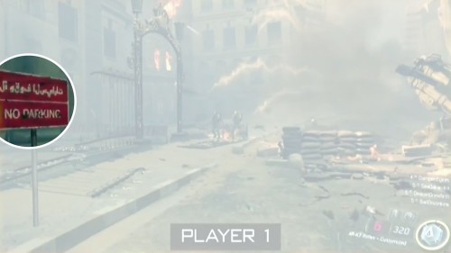
This may sound like an overly specific problem case, but it turns out that a lot of this garbled Arabic gets put out into the world, enough for me to maintain a blog on the subject that has consistently received submissions for years. It seems that well-meaning graphic designers with no knowledge of the language copy and paste the text into an Adobe product—which did not support Arabic by default until the Creative Cloud era—and call it a day. Without a correct understanding of the script, they wouldn’t be able to tell that what they had produced was not Arabic, and none of the tools in their pipeline would register it as an error. The result is garbled Arabic in extremely high-profile places, like at the Athens Airport, in Pokemon Go, in a Lil Uzi Vert video, in Coke ads, Pepsi ads, and Google ads, in Captain America: Civil War, and in anti-Trump artwork, to name a few.
It is better to display nothing than to butcher Arabic like this. Seeing this kind of mistake in public so often is hurtful: It’s a reminder that not only is most software biased against scripts like Arabic, but also that no one involved in any of these major productions cared enough to check their work. In a world of Muslim bans and foreign-backed violence in the Middle East, this digital alienation becomes just another way to feel unwanted in an unwelcoming world.
Getting in shape
The good news is that avoiding this mess is possible. In order to understand how to properly render non-Latin text, you’ll first need to understand what it takes to display text, and to do that we need to talk about shaping.
All digital text must be shaped, at the very least, in order to be displayed correctly. Shaping is the selection and placement of glyphs to display textual data. Digital text is encoded as a sequence of code points, numbers assigned by the Unicode standard to represent abstract characters in a writing system. To shape text in a given font, for each of these code points you must:
Pick the correct glyph to display out of the font, and
Decide where on the screen to place the chosen glyph.
Text shaping does not solve issues like mixing multiple languages, switching script directions, or language-specific font selection, but shaping is a foundational part of a correct text system, and it needs to work correctly before other progress can be made.
Anyone who has developed a text display system has performed text shaping, probably without realizing it. Most homegrown solutions work like this:
Place a cursor at the start of where you want to display text.
For each character, pick the glyph out of the font that corresponds to that character, and draw it on the screen at the cursor.
Move the cursor to the right by the width of the glyph.
If the character is a newline character, move the cursor down the height of the character and back to the horizontal position.
Repeat from step two until all of the text is displayed.
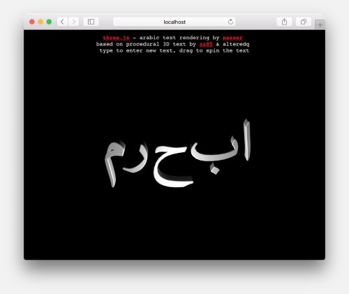
The problem with this approach is that it bakes in two assumptions about text that are not correct in every case: Step two assumes that for every character there is exactly one visual representation, and step three assumes that text always flows from left to right. Both assumptions are contradicted by Arabic, a language in which the same character will have different visual representations depending on where it appears in a word, and that flows from right to left.
On the other hand, it’s not an unreasonable solution to the problem. I’ve written code that looks like this before, and you’re sure to find it in many high-profile production systems, from ImGui to Three.js. These lines of code and others like it add a character’s width to the horizontal position of the cursor during text display, effectively hard coding the above assumptions. This is, like ASCII, the Worse Is Better solution: a simple implementation that sacrifices correctness.
Unfortunately, there is no single simple algorithm that will correctly shape text in every possible script. Human language is too complex and arbitrary for that, and the positioning of glyphs in many languages depends on intricate regional rules. To do it right, you will have to use a text shaping library that tells you which glyphs to display and where to place them. The nice thing about this approach is that once you have a library in place, as long as you use it correctly and keep it up to date, you can rest easier knowing that you’re unlikely to mess up languages again.
Text shaping libraries are the reason that computers are usable at all by readers of non-Latin languages. By virtue of serving a global audience, every operating system has one built in at this point: macOS and iOS have Core Text, Windows has Uniscribe, and Linux UI frameworks tend to use the open-source HarfBuzz. Browsers are under a similar pressure, and tend to do very well at rendering text by integrating text shaping libraries; they often use HarfBuzz as well.
Getting it right
By now, I’ve hopefully convinced you that this is a problem worth addressing. If you want to avoid mangling non-Latin scripts, there are a few things you can do.
Show someone, or don't do it
The most important piece of advice I can offer is not technical: If you are dealing with text in a language with which you are unfamiliar, it is your duty to find someone who is fluent in that language to vet your work. Ideally, you work at a company or in a community that is already diverse enough that such mistakes can’t slip through the cracks and get out to the public. Failing that, if you’re working somewhere that has funding, some of those funds need to go towards paying people to vet the way your system deals with non-Latin text. Open-source projects can usually rely on goodwill to get people’s eyes and feedback for free.
If you really do not have the resources to find anyone fluent in that language, then you don’t have the resources to work in foreign scripts. The least you can do is write the necessary code to check and display an error message explaining that your system does not support non-Latin text, but might in the future. This is infinitely preferable to the silent failure that most systems exhibit today.
Use what's already there
Technically, to render non-Latin text correctly, you need access to a shaping library at the minimum. Beyond that, if you want to mix scripts or language-specific fonts, you need additional support from text layout libraries like fribidi or the more complete libraqm. The easiest way to find and integrate these libraries is to not do it at all: If you have access to a system that already uses a text shaping library, you can use that to do your text rendering and make it someone else’s problem.
The examples I am going to give are all browser-based because that’s where I do a lot of my own work, and because the browser presents unique challenges by virtue of being removed from the low-level world of C, which many text layout libraries were written for. If you’re just rendering text in the DOM, you should be fine, unless you’re doing something particularly esoteric. As I mentioned above, every modern browser already integrates the necessary libraries to shape text in the DOM. This has wide-reaching implications, particularly that browser-based app frameworks like Electron and Cordova get good text rendering for free.
This support extends to the canvas element as well—so even if your work is not directly in the DOM, you can lean on the canvas to render text and you’ll likely be OK. You can see this in the PixiJS text demo, which correctly renders non-Latin text even in their heavily styled rich-text example. Despite being a WebGL-based 2D renderer designed for games, by utilizing the browser to render text, Pixi.js and projects based on it will avoid ending up on my blog.
The same trick is available to Three.js, as evidenced by this codepen. If what you need is a flat rendering of text, using the canvas is a great way to get the browser to do the hard work for you.
Integrate a shaping library client-side
There are situations in which you cannot depend on the browser and you have to get your hands dirty with shaping yourself. Three.js’s 3D text, a fun use of WebGL that does not work with Arabic by default, is a great use case for this. Three.js has built in support for fonts and text geometries, but because they’re trying to do something the browser does not directly support, they are forced to handle the whole stack themselves. Unfortunately, in addition to hard coding left-to-right text flow, as seen above, the Three.js font system is built on Facetype.js, which encodes fonts as JSON data that maps characters to vector paths. This once again makes the subtle assumption that every character will have exactly one representation, making it unusable for languages like Arabic.
All is not lost, however. Three.js text geometry uses ExtrudeBufferGeometry internally to turn the flat vector shapes of each letter into 3D objects. All we have to do is pass it the flat vector shapes of correctly shaped text, and we’ll be in business.
There are two options for shaping libraries in the browser: HarfBuzz itself can be compiled and used via Emscripten, or you can use a younger, pure JavaScript font engine called fontkit. Fontkit is an exciting project because it aims to unify a lot of text shaping concepts under one tool, and its JavaScript implementation makes it more approachable to web developers. (Note that there are some very subtle rendering bugs still being worked out, which is understandable given its age.)
I have more experience with HarfBuzz, and since it’s an actively maintained and battle-tested library, I feel comfortable depending on it. There is an Emscripten port, originally made by Prezi, that builds just fine. I forked the project and added a JavaScript API to make it easier to use for JavaScript developers. You can clone the repository and follow the build instructions in the README, or grab the pre-built JavaScript file from the release. Load it into an HTML page, start a local server, and the global harfBuzz object should be available to you. If you’re serving font files as well, you can start shaping right away.
harfBuzz.createFont("/amiri-regular.ttf", 32, function(font) {
    console.log(harfBuzz.shapedRaw(font, "Hello"));
});

0 : { codepoint: 43, xAdvance: 22, yAdvance: 0, xOffset: 0, yAdvance: 0, yOffset: 0 }
1 : { codepoint: 72, xAdvance: 13, yAdvance: 0, xOffset: 0, yAdvance: 0, yOffset: 0 }
2 : { codepoint: 79, xAdvance:  7, yAdvance: 0, xOffset: 0, yAdvance: 0, yOffset: 0 }
3 : { codepoint: 79, xAdvance:  7, yAdvance: 0, xOffset: 0, yAdvance: 0, yOffset: 0 }
4 : { codepoint: 82, xAdvance: 15, yAdvance: 0, xOffset: 0, yAdvance: 0, yOffset: 0 }
length : 5
We create a font (in this case the excellent Amiri by Khaled Hosny) by loading it off of the server asynchronously and specifying the size. Once the font has loaded, we pass it to the shapedRaw function along with the text we want to shape. shapedRaw is a thin wrapper around HarfBuzz’s C shaping implementation that does the necessary data conversions for us. What we get is an array of JavaScript objects describing which glyph to pick out of the font (codepoint), how far to move the cursor (xAdvance, yAdvance), and how far away from the cursor this glyph should be drawn (xOffset, yOffset). Keep in mind the meaning of “codepoint” in this context: It is not a Unicode code point, but rather an index into the font’s internal glyph table that tells you exactly which glyph to draw.
What’s most exciting is that with HarfBuzz in place, shaping will work the same, so long as your font supports the script. Here’s Aref Ruqaa, another Khaled Hosny font, which vertically stacks the letter م. By repeating the letter م and checking the shaping data of the last character, we can confirm that the yOffset is non-zero, indicating that we would have to draw this م higher up for it to render correctly.
harfBuzz.createFont("/arefruqaa-regular.ttf", 32, function(font) {
    var buffer = HarfBuzz.shapedRaw(font, "مممممم");
    console.log(buffer[5]);
});

codepoint : 556
xAdvance  : 14
xOffset   : 0
yAdvance  : 0
yOffset   : 48
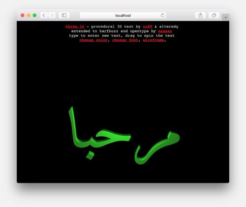
Text shaping is just this simple bit of data on each character. Arriving at that data is rather difficult, but once it’s handed to us, it becomes manageable. All that remains is to draw the text. This requires the ability to look up glyphs by their index in a font file and get their vector paths. Fortunately, opentype.js does exactly that in node and in the browser. My HarfBuzz.js fork is designed to work with opentype.js, so when it’s available, conversion to drawing commands is a snap. We can confirm it by rendering مرحبا — “Hello.”
harfBuzz.createFont("/arefruqaa-regular.ttf", 32, function(font) {
    console.log(harfBuzz.commands(font, "مرحبا"));
}

...
1 : Array(16)
  0 : { type: "M", x:   7.5625, y:  0 }
  1 : { type: "L", x:  12.0625, y:  4.21875 }
  2 : { type: "L", x:  12.0625, y:  4.21875 }
  3 : { type: "Q", x1: 10.75,   y1: 5.90625, x: 9.4375, y:  7.53125 }
  4 : { type: "L", x:   9.4375, y:  7.53125 }
  5 : { type: "L", x:   9.4375, y:  7.53125 }
  6 : { type: "Q", x1:  8.125,  y1: 9.15625, x: 6.8125, y: 10.78125 }
  7 : { type: "L", x:   6.8125, y: 10.78125 }
...A lot of output is omitted here for brevity, but harfBuzz.commands gives us all of the appropriate Move, Line, and Quadratic Bézier curve information we need to correctly reproduce our text in the given font. These drawing commands are fairly standard, and they’re exactly what Three.js uses to represent shapes. Combining the two is well within reach. I put together a complete project demonstrating what the integration looks like.
This is a great way to get correct text shaping in your application, but it comes at a cost. HarfBuzz.js is 1.8 MB of JavaScript and gzips down to 292 KB. Many projects, especially libraries, will be unable to take on this additional bandwidth burden. Unfortunately, this is part of the cost of a complete solution. There isn’t really a quick and terse way to do what HarfBuzz does without sacrificing correctness somewhere. This is especially frustrating given that shaping libraries are built into every browser but have never been exposed via a JavaScript API for our use, which forces us to take on this complication.
Integrate a shaping library server-side
One way around the issue of large files is to do all of your shaping on the server and send data back to the browser. The nice thing about this technique is that you can use HarfBuzz itself directly via a native node addon. A node-HarfBuzz npm package exists, but it’s crashing at the time of this writing, so I recommend using my patched branch until my fixes are merged upstream. The server-side approach has the added benefit of not requiring your fonts to be downloaded onto the users’ machines—they stay on the server, and all you ever send is ready-to-display vector data. I put together a server-side demo that is structurally identical to the client-side demo, but gets its shape data from an API call.
Better is better
Written language is one of the most beautiful and complex innovations the human race has ever accomplished. It is evidence of a deep and ancient need to bring thoughts out of our heads, communicate with one another, and leave a mark that will outlive us. The wide variety of writing systems in existence shows us how many different ways there are to do this, and each is wonderful and quirky in its own way. Supporting all of human writing on a computer takes work—but the payoff is absolutely worth it. And, if nothing else, it will keep you off my blog.


